
by
_____
The other day we lost a titan of the TED stage, someone who not only changed the way we understand and communicate about data, but who used that data to enlighten us about our world and its inhabitants.
I’m referring of course to Hans Rosling, the Swedish physician, health statistician, data expert and human dynamo who passed away February 7.
As an academic, Rosling’s research focused on the complex links between economic development, agriculture, poverty and health. His work was worthy, but unknown to the wider world.
Until 2006, that is, when he stood on the TED Stage and made global trends in health and economics accessible, vivid, and meaningful to everyone. TED gave him a unique and powerful platform to spread the gospel of public health data.
Rosling believed that if publicly-funded data were widely available, then each of us would be able to follow public health trends and other social and economic developments, and use that knowledge to gain a more nuanced and truthful understanding of human progress.
Thanks to his electrifying TED performance, Rosling became a data rock star. He went on to give a number of other captivating TED talks, and in 2010 he presented a television documentary The Joy of Stats, on BBC Four in the UK.
It was Rosling’s son, Ola Rosling, who built the Trendalyzer software that converts international statistics compiled by the U.N. and the World Bank into moving, interactive graphics. Rosling, his son and daughter-in-law Anna Rosling Ronnlund founded the Gapminder Foundation – “a fact tank – not a think tank” – to visualize world developments.
They used their tools to promote the importance of reliable statistics and verifiable facts, counter misconceptions and cultural stereotypes, and fight ignorance on topics like climate change, child mortality, HIV rates, and poverty.
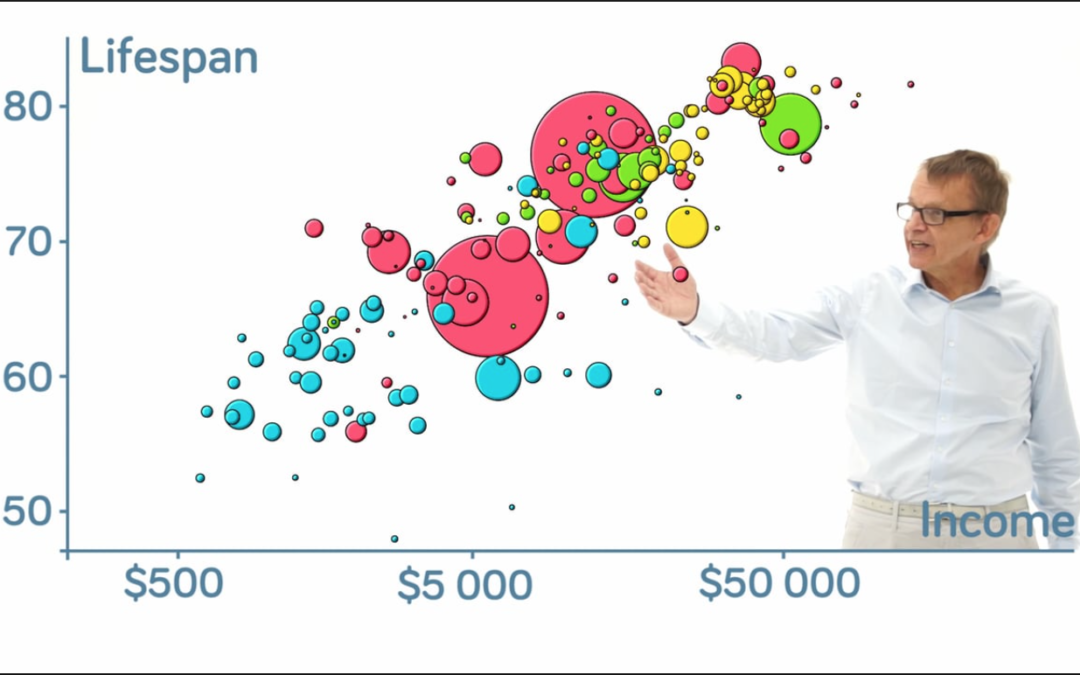
In his 2006 TED Talk, Rosling begins with the simple declaration, “We start the world.”
Then he hits a key on his laptop and behind him the screen lights up. Colored circles and dots scatter across a graph with x and y axes, reflecting the passage of time and changing health and economic conditions around the globe.
Then Rosling leaps into action. With his back to the audience, facing the screen, and arms outstretched overhead, he moves his body along with the spheres, a champion for public health advancements around the world.
“Can you see?” he calls out to the audience. “It’s China here, moving with better health there. All the green Latin American countries are here – moving towards smaller families. Your yellow ones here are the Arabic countries, and they get larger families . . . and this is India. Indonesia’s moving on pretty fast!”
On and on it goes, with data and decades flying by. Rosling narrates with speed and urgency, as if he’s calling a horse race that’s neck and neck in the final stretch.
In that choreographed performance, he creates a seamless connection between himself, his visuals, and the observers. As the data moves across the screen, we get the feeling we’re actually witnessing Rosling’s thoughts in motion.
Rosling’s talk demonstrates that the sophisticated new tools of data visualization are most effective in the hands of a speaker who’s fully in control of his material and completely engaged with his audience.
“I end now with the world,” Rosling says, and with that he offers one final Gapminder animation that correlates Internet use around the world with rising economic prosperity.
He ends on a hopeful note:
“It’s as if the world is flattening out, isn’t it? These countries are lifting more than the economy,” he says. “It will be very interesting to follow this over the years, as I would like you to be able to do with all the publicly funded data.”
In just 19 minutes, Rosling sets a new standard for the presentation of quantitative information – and changes public speaking forever.
© Copyright 2017
* Take a look at the best Hans Rosling talks you’ve ever seen, complied by TED.
Want to talk? Reach me at dana@danarubin.com